
Build a box-picker entry page for new sign-ups
New customers land on your sign-up page and the very first thing they hit is picking a box. Up until now that was a plain list. You can now build a real box-picker entry page that greets them first, so choosing a box feels like the start of an experience instead of a form.
Here's the idea. You group your boxes into "types" that make sense to a shopper, like Mixed Harvest, All Fruit, or Build Your Own. Each type gets its own image and a short description, and you map its Small, Medium, and Large to real boxes you already sell. Leave a size blank and that button just disappears. You set it all up under Products → Boxes → Box Signup Groups.

Then you pick how customers see it. There are two layouts: Cards, which lays every type out as a nice row of cards they can compare side by side...
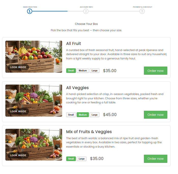
or Wizard, which walks them through it one question at a time. Flip it on and, when someone reaches sign-up without a box picked yet, they get sent straight to the layout you chose. Leave it off and everything works exactly like it does today.
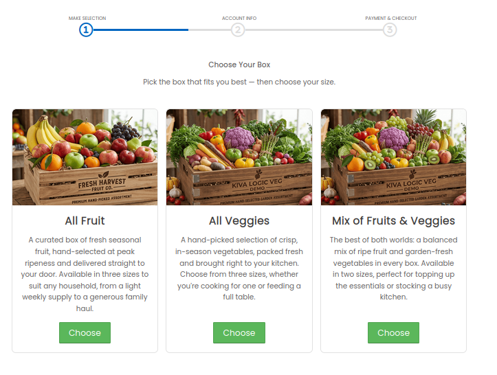
which then prompts for what size:
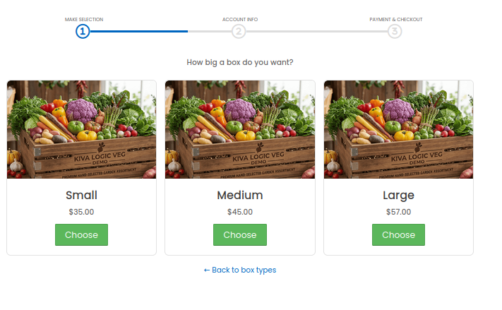
The whole thing rides along with the normal sign-up flow, progress bar and all, so once they pick a box and a size they drop right into account creation with that box already selected. No dead ends, no re-picking.
Give it a try on your own site and see which layout feels right for your shoppers. Let us know if you run into anything!