Skip to content Accessibility Notice Statement
Loading...
loading gif
Close Menu Login How It Works Changelog Blog Documentation Pricing Contact Phone: 207-812-9136
Kiva Logic Kiva Logic
Sign Up Login Contact Pricing How it Works Docs

Browse by Date

2025
  • March (1)
  • February (2)
2024
  • July (1)
  • June (1)
  • April (2)
  • March (2)
  • February (3)
  • January (1)
2023
  • November (1)
2022
  • April (1)
  • February (1)
2020
  • November (1)
  • March (1)
2018
  • October (1)
  • May (1)
  • April (1)
  • March (1)
  • February (1)
2017
  • December (1)
  • November (1)
  • January (2)
2016
  • April (1)
  • March (1)
2015
  • January (2)
2014
  • December (2)
  • November (1)
  • August (1)
  • June (1)
  • January (1)
2013
  • December (3)
  • September (1)
  • June (1)
  • May (4)
  • March (2)
  • February (7)
  • January (3)

Apr 16, 2024

Pixel and Small Signup Updates

There's been a 2px difference in the mobile navigation bar that's been driving me crazy. The padding around the hamburger menu is the same on the top and the bottom, but the way the other CSS is on the navigation bar, the height was coming out 2px shorter than it should be, making it look like the bottom of the navbar was too short, or slightly squished.

Today, that stops. The padding issue has been fixed and the navbar is a nice round 48px high.

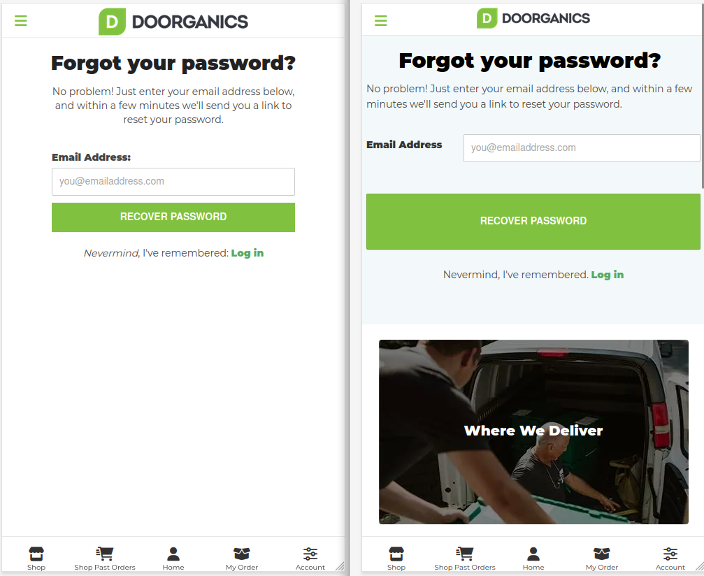
The login and forgot password pages have been standardized a bit more, and on mobile some other measures such as removing the footer, cleaning up and 'above footer content', and moving some pixels and padding around has given it a much cleaner look. New is on the left, previous is on the right (thanks Doorganics, I'm using you as a screenshot example a lot lately):

And to compare the forgot password page now, same thing. Notice the headers, text, inputs all look consistent with the login page. New is on the left, previous is on the right:

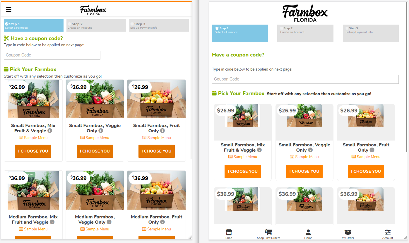
The big change on the Sign-up page is migrating to using flex-box for more even spacing and layouts of the boxes. I've been doing a lot of elements in the shop like this recently, so it's nice to get the boxes done. Also,

  • better image sizing to fit on multiple screens
  • desktop down to 538px screen width display three boxes per row, then we go down to two boxes per row, and at tiny screens we go down to one.
  • made the currency symbol smaller, top aligned to reduce emphasis
  • removed the lower navigation tray, too distracting for this page
  • new icons for the three step progress bar at the top, better spacing, better font sizing

Thanks FBFlorida here, new on the left, old on the right.


Try Kiva Logic Today

Sign Up


Want to learn more?
2024 04 08 spring updates
2024 03 20 the menu builder update
2022 02 15 box product updates 1 2

Shop

Shop Past Orders

Home

My Order

Account
Quick Links
Home Page
How It Works
Changelog
Pricing

Documentation
Blog
Uptime
Status

Contact Us
Crafting the perfect beauty box how subscription box software enhances the customer experience
Accessibility Notice Statement
Do Not Sell My Personal Information
Learn More!
Home Delivery Software as a Service
What Does Kiva Logic Do.
Software for Home Delivery
Home Delivery Software Solutions
Admin Screenshots

Produce Delivery Business/CSA
Meal Delivery Software
Dairy Delivery Software
Kiva Logic
207-812-9136
[email protected]
kivalogic.com/

Updates
May 17, 2025

A new table for managing map data has be...

May 15, 2025

A new setting has been introduced to enh...

May 15, 2025

Noteworthy changes in our latest update ...

More Updates

Delivery Management Software by Kiva Logic
© Copyright 2010 - 2025 Kiva Logic. All Rights Reserved.

Privacy Policy | Terms of Service | Data Processing Agreement


Loading